
New AI transforms radiology with speed, accuracy never seen before
May 29, 2025
EVANSTON - Working with the Goldsholls’ family archive and lenders in Chicago and the East and West coasts, as well as partners at the Chicago Film Archives, the exhibition “Up is Down: Mid-Century Experiments in Advertising and Film at the Goldsholl Studio” will include rarely seen films, as well as light experiments, posters, print advertisements and package design that tell the story of the creative life of the studio.
The exhibition will run Sept. 18 to Dec. 9 at the Block Museum, 40 Arts Circle Drive on the Evanston campus.
Highlights include:
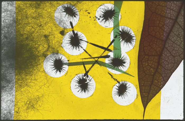
“Untitled Light Paintings” (1939-1940) - A highlight of the exhibition will be the display of a series of “light paintings” created by Morton Goldsholl. In the early 1940s, Goldsholl assembled approximately 40 miniature collages between two pieces of 35-millimeter slide glass. He combined bits of leaves, cotton, seeds, insects, feathers, paint and fragments of film to create colorful abstract imagery that is transformed when projected. When light is shown through the slides, these experimental assemblages become ephemeral abstractions. When Goldsholl first showed the light paintings to his teacher, László Moholy-Nagy, the latter was so enthused with the results and the innovative use of light, color, form and texture, that he asked Goldsholl to share them with the entire School of Design. As Goldsholl explained at the time: “Moholy-Nagy grabbed me, and he grabbed my projector and he grabbed the light paintings. We went through the whole school that day. Every classroom, every one of the classes had to see the full 40 light paintings that I had made, and he said this is what I consider painting with light.” The exhibition will include a selection of light paintings that show the range of effects Goldsholl was able to create with this experimentation with color, form and light.
“Faces and Fortunes” (1959) - The film that solidified the Goldsholls’ standing as “designers in film” is a visual tour-de-force of the history and value of corporate branding. Produced for Kimberly-Clark as part of the corporation’s efforts to position itself as the leader in paper production, “Faces and Fortunes” grows out of Morton Goldsholl’s research and pioneering work in the then-nascent field of corporate identity. Featuring 15th-century woodblock prints collaged with streamlined heraldic shapes and abstract logo forms, stylized animation and a stop-motion assemblage of real-world objects, the film serves as both an essay on and visual demonstration of the way identification symbols function in the rush of contemporary life. Distributed to clients, consumers and college students, the film not only demonstrated the way branding works, but also provided viewers with the tools necessary to critically analyze new visual landscapes.

Caption: Goldsholl Design Associates, 7UP billboard design for “See the Light” Campaign, c. 1975. Courtesy of Dr. Pepper Snapple Group.
“See the Light” (1975) - This short television ad grew out of a larger campaign to rebrand 7UP and its products, including bottles, packaging and other advertising materials. Drawing inspiration from the visual landscape of advertising itself, the ad is composed of a grid of dots, much like the electric billboards of the day. The lighted grid reflects the Goldsholl’s training with Moholy-Nagy, who emphasized light as a medium itself. It also showcases the brilliance in streamlined pictographs and minimalist trademark design, which was integral to the firm’s larger success in corporate identity design.
“Up is Down” (1969) - Dedicated to Martin Luther King Jr., Millie Goldsholl’s award-winning children’s film tells the story of difference, diversity and the potential dangers of state and social institutions through the eyes of an unconventional young boy. Combining faux-naïve, hand-drawn animations with an astonishing flash-frame montage of 20th-century atrocities, “Up is Down” is at once a children’s lesson, a political lament and a vehicle for social consciousness. It reflects many of the social and aesthetic lessons the Goldsholls first learned at the School of Design, while also expressing a growing ambivalence many at the firm began to have about the ability to solve entrenched social inequities through design.